We’re about two thirds of the way through Yahoo’s “30 Days of Change”project, and my guess is you’ve already forgotten about it. Or maybe you never heard about it to begin with. To celebrate their upcoming logo redesign, Yahoo! is releasing a different version of their logo every day for thirty days.
This immediately piqued my interest because it was out of the ordinary. Sure, they could just announce the updated logo on their website and Facebook page like everyone else, but why not do something to grab people’s attention, and give a little insight to the design process while they’re at it?
This may be one of those ideas that sounds good on paper, but doesn’t end up translating well when actually put into effect. The people at Yahoo! were smart to think outside the box on this, especially since the company has sort of slipped from relevance over the past few years. At first they did seem to garner some attention over the project, but after the initial excitement of a large company rebrand died down, I haven’t heard a whole lot about it.
 I’ve have a few problems with the project, now that I’ve seen how it’s playing out. My main issue is that there is no clear message. Why are we seeing all these logos? It seems they’re pretty much irrelevant to the actual end goal, so I don’t understand why I should care.
A better alternative would have been to show the steps of the design process. If Yahoo! did this, I would be genuinely interested. As a designer myself, I like to observe other people’s processes and how they envision and execute their ideas. Even a person who doesn’t know much about design would still find this interesting, because it would be a sneak peek with a build-up to the final logo. People generally like rewards, and will be more likely to stick it out and care about your project if they feel as if they’ve invested time for a reason.
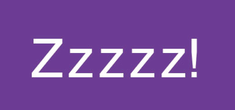
Another issue was Yahoo!’s design constraints were too narrow for a project like this. They specifically mentioned not changing the color, and not losing the exclamation point. That means the new logo will basically have a new typeface and that’s it. I’m certainly not opposed to brands going through subtle changes, in fact I think that’s often the best way to go. However, subtlety and a big design reveal project don’t make sense together. 
If Yahoo! was going all out with a brand new look, that could perhaps justify the project, but I highly doubt that is what the big reveal is going to be. So far the logos have been fairly simple and straightforward, which is fine, but not very exciting to look at every day. If Yahoo! knew from the beginning they weren’t going to use any of these logos, they should have pushed the envelope a bit more, and maybe even had some fun with it.
We’ll see what happens when they reveal the final logo in September, but I’m not going to hold my breath for something groundbreaking. I’m all for an out of the ordinary design reveal, but I can’t help but feel like they missed the mark.
However, if you want to make your own Yahoo! logo, you’re in luck! There’s a generator for that.