
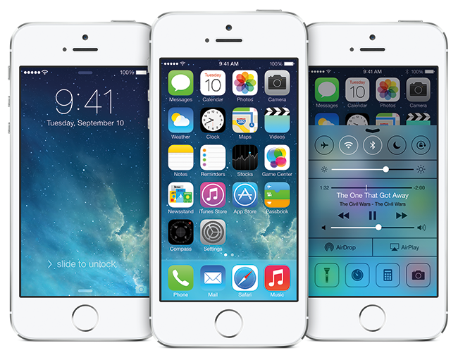
By now, everyone has noticed the shift toward simplicity in design. Whether it’s the transition from skeuomorphism to flat design on your iPhone or the recent trend in minimal logos, it seems as though this “back to basics” approach is here to stay.
Simplicity isn’t new by any means, and this shift in design aesthetics is most likely influenced with the way we use our mobile devices. Busy or complex designs don’t translate as well to mobile, and considering how much time we spend on our phones, failing to be mobile friendly would be a serious mistake for any brand.
 The difficult thing about minimal or flat design is that because it’s stripped down so much, there’s nothing to hide behind. When it comes to logos, if you take away the icons, bevels, gradients and other elements which make it unique, what’s left needs to be really well executed. Typography and color become even more important when they are the logo’s defining features. In its own way, the balance between negative and positive space becomes an important design element.
The same goes for web design. Go check the website of your favorite brands and you’ll probably notice things look a bit different than they did a few years ago. Home pages have become less busy, which is ideal for mobile versions. With less clutter, it’s even more imperative for the things left on the homepage to represent the brand and give the user the information they need. There are fewer images, so the ones chosen need to be striking. Fewer buttons and calls to action mean they are more visible and need to have a greater impact.
Some may feel these minimal designs look unfinished, or plain, but they’re actually rather complex, and can be difficult for a designer to pull off without practice. Designing with restraint requires exceptional attention to detail, and a good sense of when enough is enough. A lot of thought is involved in deciding the most important elements of a design and knowing when it’s time to lose the gimmicks.