What do kitchen supplies, building materials and dead cats have in common?
Well, usually nothing. But today they have great packaging in common. I love really clever packaging design, especially for new or unique products. Here are a few of my favorite designs for some rather unconventional products. These are projects that I imagine had really interesting design kick-off meetings, and probably left the designer feeling equal parts excited and terrified.
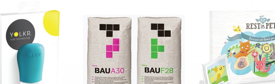
 Okay, first of all, an egg separator is something I didn’t even know I needed, but now I’m totally going to buy because this one looks awesome. The YOLKR isn’t the first product of its kind, but it’s certainly the most attractive and simplest to use. It’s also got the best branding.
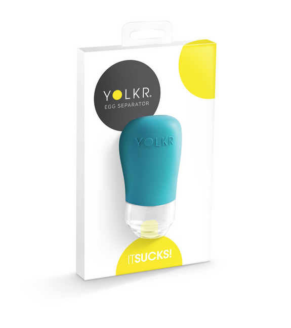
One of the first rules of branding is to never use “IT SUCKS!” as your tagline. Pretty self-explanatory. However, like most rules there are exceptions, and in this case it’s a perfect tagline. It’s a little humorous, and more than a little eye-catching.
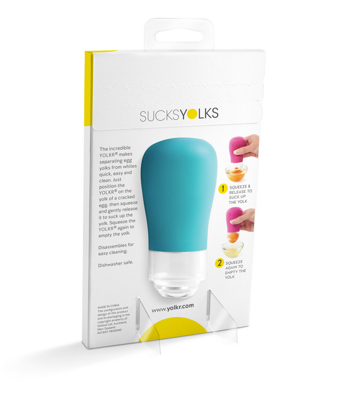 Also eye catching is the minimalist design of the packaging. The product itself is really simple (you literally just squeeze the thing), so it makes sense that the packaging would be similarly uncomplicated. The bright yellow circles, on the package and in the logo itself leave no doubt in anyone’s mind what exactly YOLKR sucks.
Besides the aesthetics, what really makes this design work is the ability to touch and squeeze the product. The YOLKR could have easily been packaged in standard box, but the wise decision was made to keep the rubber exposed on both sides. It’s no secret people enjoy interacting with new gadgets before buying them, and this allows you to do that, as well as get a sense of the quality of the materials.
 While I don’t consider construction materials “unconventional products,” I would definitely consider this an unusual design project. Surprisingly, I have once or twice found myself (wandering aimlessly) inside a home improvement store such as Lowe’s. The packaging in most of the aisles ranges from paper sack brown to grey, which is hardly a range at all. Sure there’s the occasional yellow, because “construction and caution go hand in hand!” We get it. Rarely do you see anyone in this industry thinking outside the box.
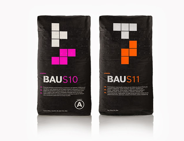
 Clearly BAU thought very far outside the box and just tossed out any preconceived notions about what building materials should be packaged like. These bags of concrete look fun, which is not something I ever thought I was say.
They used neon colors, bold fonts, and blocks that resemble the popular, highly recognizable game Tetris. Assuming they did their research, and aren’t going to encounter any copyright issues, this is brilliant! These bags stand out in a sea of monotonous packaging, and there’s absolutely zero chance you could walk down an aisle at a hardware store and not notice them.
 I promised you dead cats, and here they are. Dogs, rabbits, gerbils and whatever else you call a pet are welcome too, I’m not here to judge.
I can’t really even imagine going into a design kick-off meeting and finding out I’m designing packaging for pet coffins. But pets unfortunately do die, and it can be a really painful time for their owners, especially children. Rest in Pets has created an affordable and meaningful way to say goodbye to your beloved pets, without coming off either as cheesy or morbid.
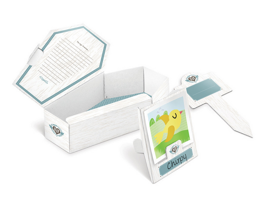
 The design actually feels extremely thoughtful and is easy to personalize. The cardboard coffins come in a couple shapes: a more traditional coffin shape, and a hexagon, for cats who like to curl up.
The inside of each box has space for a written message, photographs etc., and the outside is made to look like white wood, with a name plate. The box everything initially comes in has a very sweet scene of cartoon animals in soft colors and a banner that says “Because we loved you.” Considering the difficult, and extremely gloomy subject matter, I think Rest in Pets did an amazing job creating something that felt warm and inviting.
All three of these brands stood out to me by being different, and it’s really inspiring to see designers taking chances and finding ways to create packaging designs that are as unique as the products they house.