Pick up your phone and look at your three most used apps. Now think about how you found them. Did you read the text underneath or did you immediately find what you needed based on the app icons?
If you’re like me you probably answered “icons,” and until just a moment ago had completely forgotten the text below the apps even existed. This is because symbols are powerful design elements and thanks to technology, we’re getting better at using them to navigate our daily lives.
From Logo to Brand Icon
A few big brand redesigns have already happened in 2016 and this year the most noticeable trend has been the shift in focus from word marks to icons. This isn’t to say companies have ignored text altogether, but there’s no denying symbols are having a major moment.
![]()
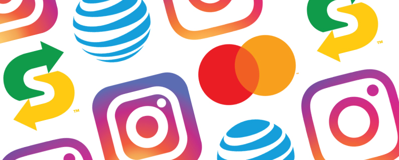
Earlier this year Instagram caused quite a commotion when they trashed the beloved camera illustration and moved to a simplified, rounder, line icon. As with all major redesigns, the always angry Internet sounded off before the gradient was even dry. But what most people weren’t mentioning, was that the “rebrand” didn’t alter the word mark at all. Only the brand icons and color palette were redesigned.

To be fair, the word mark was already good, and it’s really not used often these days, so it doesn’t come as much of a shock that they let it be. The icon is what truly represents the brand now.
Two other very famous brands rolled out new looks this year; AT&T and Mastercard. AT&T has been slowly making the shift to a simpler, less formal design for awhile. They lost the heavy, all caps look they were known for throughout the 80s and 90s and moved to a lighter, friendlier lowercase. Mastercard did the same, but in one fell swoop as opposed to gradually.
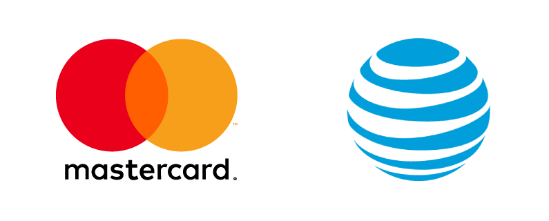
What’s interesting about these two is how you can clearly see them recognizing the importance of a strong brand icon that can stand alone. Mastercard pulled the text out of the symbol to allow for more flexibility, and AT&T is now operating primarily without text. It’s a smart, confident move, and it’s becoming much more common.
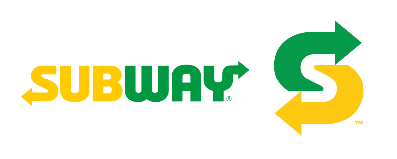
The most recent example of a major rebrand with a new icon is Subway. In this case, both the primary logo and the symbol have been redesigned. The logo itself isn’t particularly interesting, and a lot of the elements that made the old version awkward are still present. It seems like much more time and effort was spent on the icon, which will be used on apps and social media. Subway didn’t previously have a symbol, and was therefore stuck using the entire word mark, scaled down in square formats on social media.
The new Subway symbol has gotten mostly positive reviews, with many people applauding the thoughtful use of negative space. The somewhat confusing use of arrows in the main logo actually works really nicely for the brand icon. I would go out on a limb and suggest the arrows stuck around this time specifically because they worked well in icon form.
In the past, the primary logo would always dictate the pared down icon design, but times have changed. The opposite is now true. It makes sense that more designers are working “backwards” with branding. We saw a similar shift in web design. It no longer made sense to design sites for desktop use and treat mobile as an afterthought. People visit more sites from their smartphones than computers, and they see app and social media versions of branding more than full logos.
The way we use brands in our everyday life is evolving and big brands are starting to take note. It would be wise for a company of any size to take a look at their own branding and assess how well it fits with the future of technology. If a logo becomes unreadable when scaled down to the size of a mobile app and there are no alternative versions or brand symbols, it may be time to call a design expert.