
Everyone loves a good contest, which is why I got a little excited when I heard Indiana’s BMV was allowing people to vote on our state’s next license plate. I knew not to expect too much since license plate designs tend to fall somewhere between mundane and gaudy, with little room for anything attractive or interesting.
So I ventured over to the BMV site, cautiously optimistic, to cast my vote. Surely one of the options would be interesting enough to be the clear winner.
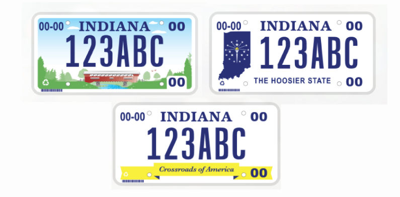
The three designs I found were blander than a rice cake. I should have known better than to get my hopes up, and I learned my lesson the second I laid eyes on these unimaginative, barely designed pieces. The one attempt at an interesting design involved a clip art covered bridge which, while I appreciate the effort, isn’t going to read well on a moving vehicle.
It’s more than a little disheartening that an object we see hundreds of every day is treated as an afterthought, not worthy of a proper design. I fully understand the license plate has a very distinct purpose (cops catching bad guys) and isn’t purely decorative. However, the same could be said for most of the objects we interact with on a daily basis, so there’s no excuse for phoning it in when it comes to license plates.
I started wondering if ALL state license plate designs are ugly or if Indiana is taking home the gold in bumper monstrosities.
Here’s what I found:
Boring license plate designs are the norm.
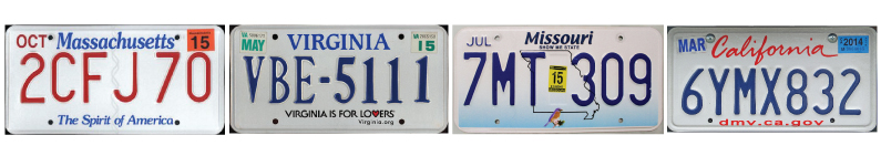
There’s a massive lack of creativity basically across the board, aside from a few exceptions. White backgrounds and red, white and blue color schemes dominate over half the designs. These designs look incredibly dated, which could be partially due to the fact some of them haven’t been touched in over fifty years. You heard that right ..FIVE ZERO.
You could easily switch out the state name on several of the plates and few people would ever notice the difference. I mean come on, isn’t California where dreams are made? Surely their license plate is well-desi—NOPE!
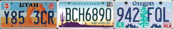
Some states at least TRIED.
There are a couple of mildly interesting designs out there. States like Utah, Arizona and Oregon got creative with their color palettes and managed to represent their landscapes without being horribly offensive to the eyes. These designs aren’t necessarily great works of art, but they seem to have been given some aesthetic consideration.
What works for one state doesn’t work for another.
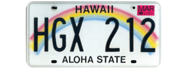
It wouldn’t make sense to slap a cute little rainbow on just any license plate, say Vermont, for instance. In the case of Hawaii though, it makes perfect sense. Hawaii is called the rainbow state for a reason, and I think the frequency of a certain weather phenomenon negates any criticism about the design being “too cutesy.”
A strong design does not equal a busy design.
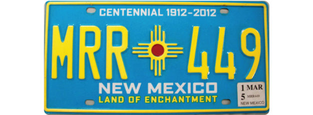
By far the best-looking license plate of any of the fifty states is New Mexico. The colors are bold, the shapes are clear, and the contrast is strong enough that there aren’t any legibility issues. The southwestern sun symbol gives it a nice personal touch, and clearly ties it in with the state flag. It’s obvious the designer put some research and thought into their choices and didn’t arbitrarily throw some clip art together. New Mexico is referred to as the “Land of Enchantment” and I believe it by looking at this license plate design.
So is there a moral to this whole thing? Maybe it’s that we should try harder. A license plate isn’t technically an advertisement, but it’s such a visible representation of our state, we could surely try a little harder to make each license plate design more interesting.