Social media changes at a rapid pace. Odds are, I’m not the first person to tell you that. It seems like the second we get used to the new Facebook, Twitter, etc. the rug is pulled from under us and we’re scrambling to learn about an even newer iteration.
Each new version brings changes in function, but the first and most obvious difference is usually in appearance. It used to be fairly easy to tell the difference between the sites with a quick glance, but those days are behind us. Most social media platforms have followed the larger-than-life image trend, and it’s getting more difficult to tell them apart.
In 2011 Facebook started rolling out their timeline layout with large cover images. Over the past few years almost every major social network has followed suit. Even LinkedIn is now incorporating cover photos, and the look feels very “Facebook.”
This should be nice! We’ve got these huge spaces to use for whatever we want, and since the sites all look the same, they must function in similar ways too, right?
Wrong.
Not only are the covers sized differently on each site, but the layout and avatar placement and shape vary as well. So once you’ve spent the time deciding how you’d like to use the space for Facebook, you’ve then got to do it all over again for Twitter, Google Plus, LinkedIn, Youtube, etc. Once you’ve done all that, then you get to test them all out on mobile.
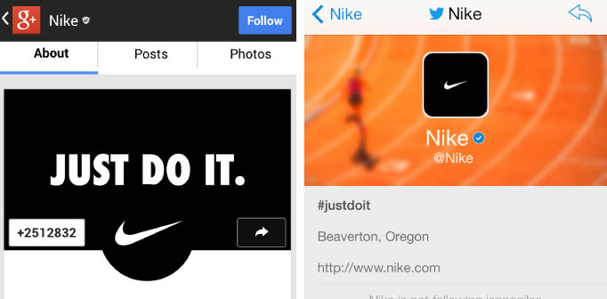
So for example, say Nike wants to get all their sites looking uniform…
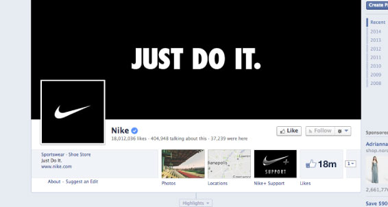
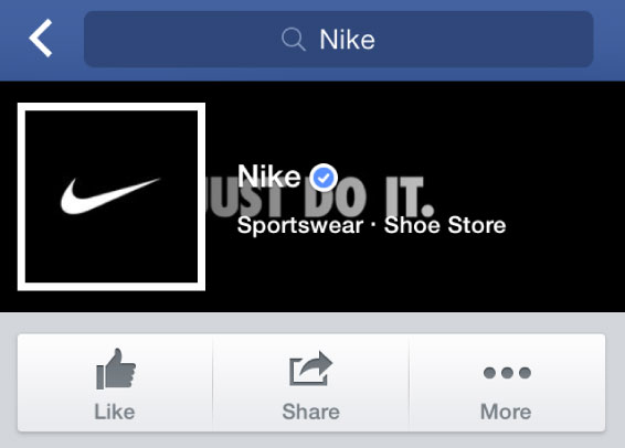
“Oh wow, that’s looking really sharp!” they probably thought to themselves. But check out the mess you find when you go to the Nike page on the Facebook for iPhone app.
This looks like an accident. Maybe it’s just Facebook? Let’s try Google Plus, and maybe even Twitter!
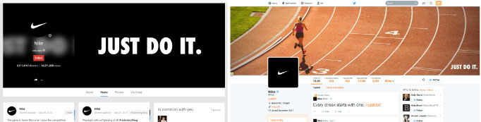
Huge images- GROUND BREAKING.
Ok, but in all seriousness, these look alright on the web. Nothing to really complain about, unless you want to hear nitpicking, in which case, that partial blur on Google Plus is completely useless and makes everything hard to read.
But let’s check them out on mobile, since that’s how a lot of people view these sites anyways.
There’s definitely some awkward cropping and overlapping, but compared to Facebook mobile, these aren’t terrible.
So when dealing with covers, as long as you keep in mind gradients, color overlays, centered avatars, circular avatars, rounded square avatars, avatars near the top, and avatars hanging from the bottom everything will be fine.
Fortunately, there’s a way around this mess. When you were initially forced to go through the tutorial to set up “new Twitter” you may have noticed a little pop up, and it actually contains the answer.
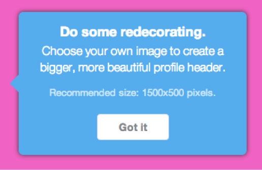
Cover photos aren’t that important. Yes, I said it. The graphic designer has decided the most visually dominant thing on the page doesn’t matter that much. We can’t exactly control the way our covers look on all computer monitors and every single smart phone screen, so we aren’t going to try.
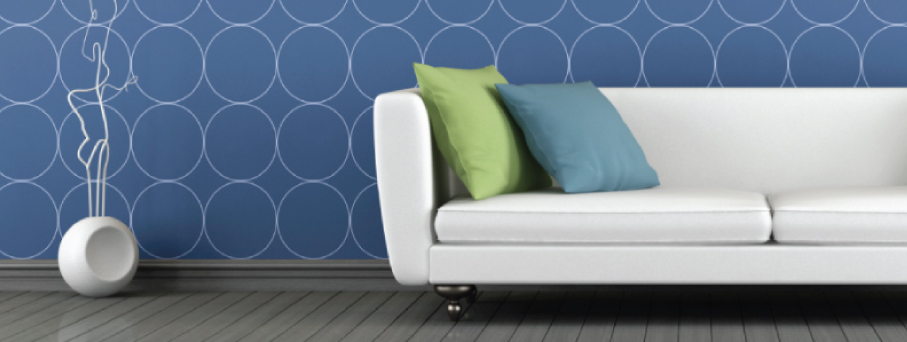
These cover images, while huge, are secondary to the content on the page. They’re the social media equivalent of the wallpaper in your home. They aren’t meant to contain important information. Frankly, they’re just there to look pretty.
Things that work best in these areas are things that don’t matter, like textures, patterns, out of focus photos, and collages that don’t have a central focus. These areas are still useful to brands, we just need to stop trying to use them as billboards and instead treat them like wallpaper. If done properly, a cover photo will welcome the viewer and provide a sense of familiarity, but then fade into the background to make way for your more important content.