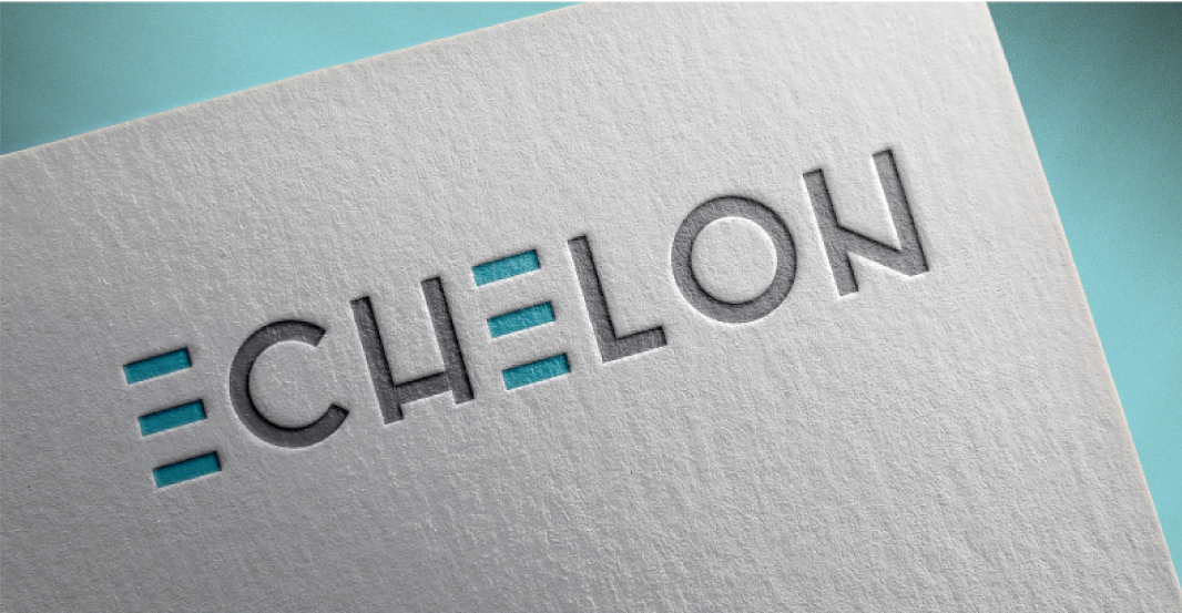

Echelon Properties is a series of multi-family rental properties owned by the Garrett Companies. With multiple locations all over the United States, we needed to create something versatile and recognizable for their branding. Each location would need to have the flexibility to infuse their own regional personality into the brand.
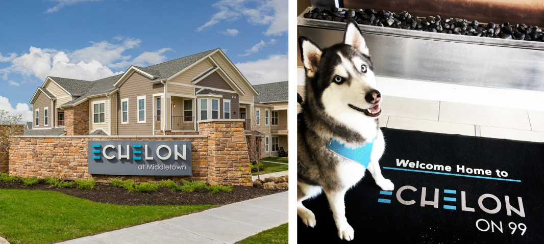
Throughout the entire process I kept in mind the many ways the branding would be used; from large scale signage to tiny avatars, to you guessed it -- rugs where cute dogs could sit!
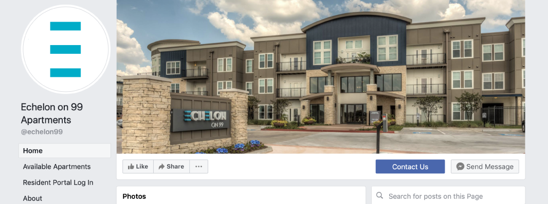
It was especially important for Echelon to have a strong and simple icon as a part of the branding. They requested something abstract that could stand on its own in places where the full logo wasn't a good fit. We settled on the three lines from the "E" because they stood out on their own, were easily adaptable for different uses and represented the clean, geometric style of the architecture.
Throughout the entire process I kept in mind the many ways the branding would be used; from large scale signage to tiny avatars, to you guessed it -- rugs where cute dogs could sit!
It was especially important for Echelon to have a strong and simple icon as a part of the branding. They requested something abstract that could stand on its own in places where the full logo wasn't a good fit. We settled on the three lines from the "E" because they stood out on their own, were easily adaptable for different uses and represented the clean, geometric style of the architecture.
