I usually ask new clients for a few descriptive words to sum up the core values of company. They start off great and I get things like “loyalty,” “quality,” etc. However, once they hit five or six terms, I have to cut them off. I’m sure those next ten or so words are really great, and I bet the company really does pride itself in them, but we have to draw the line somewhere.
I’m sure you’ve heard some version of the phrase “if everything is the most important, nothing is.” This is particularly true in design. Picking one or two important focus areas for your brand is crucial. Consumers in the digital age are bombarded with brands. Most of us see and interact with hundreds of brands, all day long, whether we realize it or not. With such a steady stream of quick information, it’s important for companies to choose one or two things which will help them stand out.
Two of the best design practices to understand when going into a new project are editing and hierarchy. Unfortunately, they are also two of the hardest to explain to clients. It’s hard to take a step back from your own brand, and not only rank your key traits by order of importance, but then agree to let some of them go.
The thing to remember, is no one is asking you to NOT be great at those other things, but spreading yourself too thin means your company lacks depth and expertise in one area. If a consumer feels your company isn’t the best at something, there’s a good chance they are going to move on. Similarly, if a potential customer comes across your brand’s marketing and it sends them muddled or conflicting messages, they are probably going to forget you.
This is where the designer comes in.
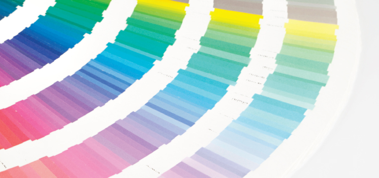
It’s our job to help clients organize and prioritize information, and then use color, size, placement and negative space to draw attention to the important stuff.
Put yourself in the consumer’s shoes. Imagine you’re perusing the Internet one day and on the current site you’re visiting, there are two ads of identical size, for similar products.

One of them is bright, simple and has one call to action, “END OF SUMMER SALE.”
The other is packed with information– several calls to action, a huge logo, a tag line about how great the company is, the phone number, a couple of photos, a starburst that says “SALE!” maybe some fine print and an expiration date. That’s a lot for one person to take in! We each only have two eyes after all, and few people have the attention span to make it through such a dense ad.
The simple ad is going to stand out and be the clear winner most of the time. Odds are, that brand has a phone number, several other good deals, and photos as well, but they made the choice to edit themselves and focus on one thing above the others. They also let their call to action be the most prominent thing, through color, size and space, which is exactly how visual hierarchy works.
These are very simple design tricks, but they really do make all the difference. Don’t try and force your brand to be everything all at once. Showing this kind of restraint can be difficult at first, but it implies a confidence in the brand, and a level of sophistication people will naturally be drawn to.