It’s no secret most designers (myself included) get excited when we run across a great book cover. I’ve even written about them in the past and recapped some of my favorites and why I think they were so successful. I’m one of those odd creatures who despite it being 2016, still prefers a physical book over an iPad or Kindle, and I will often go out of my way to find the specific cover I like. I can be indecisive about which covers I choose, but there is one type that I always steer clear of when I have the chance.
The dreaded movie tie-in.
I once heard someone say something along the lines of “one way in which it’s ok to be snobby is refusing to buy the movie tie-in cover of a book,” and I couldn’t agree more. There’s nothing sadder than a great book cover design which has been replaced by a tacky movie scene, and believe it or not, sometimes I don’t want to look at Leonardo DiCaprio’s face.
Here are a few covers that make me particularly unhappy.
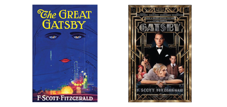
The Great Gatsby:
This is probably the most iconic book cover in the history of American literature, people. If aliens landed on earth and saw this artwork, I’m pretty sure they would recognize it immediately. There should be a strict policy that states no other designs for this cover can ever be printed. Carey Mulligan and Leo look great, but if anyone needs to see their faces in order to be interested in this book, they probably aren’t going to enjoy the story to begin with. A little-known artist, Francis Cugat illustrated the original cover, and the art itself was written into the book. Redesigning the cover seems like an exercise in futility at this point.
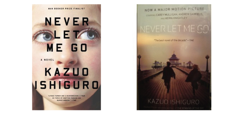
Never Let Me Go:
This is one of my favorite books of all time (so please let me know if you’d like to borrow it.) The plot of this book is so subtle and chilling as it follows a group of children growing up in an extremely unconventional (ie. terrifying) boarding school. Summarizing it any further would spoil it, but trust me, it’s unsettling. The movie tie-in cover isn’t horrible, but when I see Andrew Garfield and Carey Mulligan (again) running across a dock this feels like a Nicholas Sparks love story. The version on the left does a better job of capturing the innocence and bewilderment of the characters, who we meet as young children.
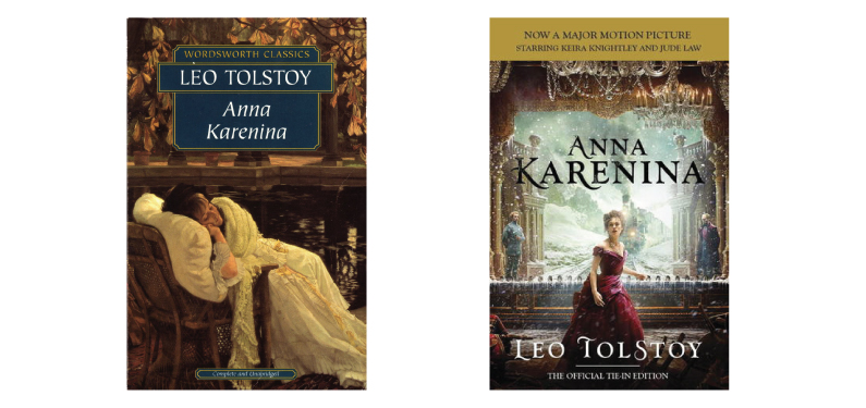
Anna Karenina:
I really don’t think it’s fair to imply this story is just about a woman choosing between two men. Sure, there is love in the book, and certainly some risqué infidelity, but it’s all pretty destructive and ends in a lot of sorrow and isolation. The original cover isn’t necessarily my favorite design, but it very much seems to reflect the heavy story inside. The movie tie-in cover also insists on practically screaming about the book being made into a movie, which seems like a cheap trick.
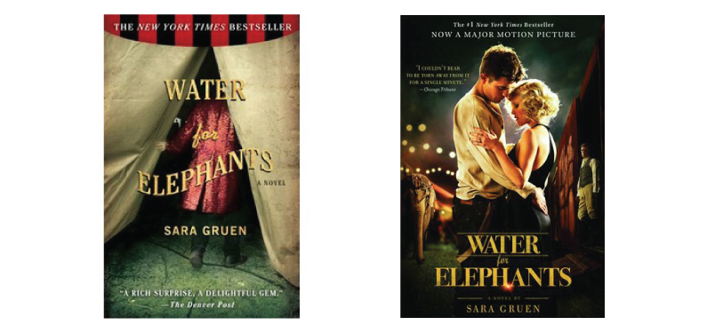
Water for Elephants:
This is an example of a good book, bad movie and the cover very much reflects that. Robert Pattinson is a lovely person, I’m sure, but he should not be on the cover of anything you would like readers to take seriously. Also, why am I seeing the entire plot before I’ve even opened the book? The original cover gives me all the information I need. There is a circus, and probably something shady is going on.
I think the issue I have with most movie tie-in covers is that they really seem to dumb down these amazing stories, and assume we are only interested because our favorite A-lister was involved in the movie adaptation. I would never want to discourage anyone from picking up a book for any reason, so if that’s what gets someone interested in reading, so be it. However, with that being said, I’m going to keep going out of my way to find the book with the best cover possible.