A lot happened last year in terms of rebranding. Not unlike highschool students, brands have many different personalities, and those really come to light during a major aesthetic redesign. Here are a few of the most interesting characters from the class of 2013.

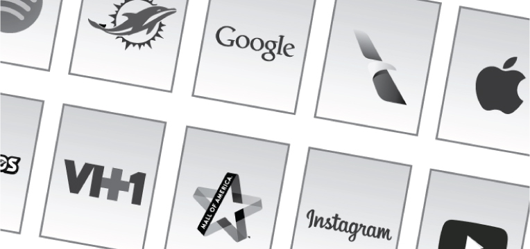
It’s fairly easy to improve a logo where an animal is wearing a helmet. Step 1: Remove helmet. Step 2: Save file. However, Miami went further than that by streamlining the stylized dolphin, and giving the design a sense of motion. With a few simple changes this logo went from goofy and cartoonish to fierce and sleek, so in high school terms, this logo “got hot.” Good job, Miami Dolphins!
 This was a subtle change which may have gone unnoticed by some people, but that’s not necessarily a bad thing. The old logo wasn’t exactly terrible, but when compared to the new version, the custom lettering by Mackey Saturday is much more polished and has a better flow. All other social media sites either want to date or be Instagram.
 Where to even begin here. JCPenney flip flopped more times than a politician during election season. After a few impulsive and ill-advised brand and business model overhauls, and an apologetic tv commercial, the company is now attempting to go back to the start and win back their angry customers. It’s hard to say if the people at JCPenney have any idea where the future of the brand lies, but if they try hard enough, they just might be able to out-crazy their own Hitler teapot.
 I was surprised by this update. I normally believe the saying “if it’s not broken don’t fix it,” but the new modern, slim serif font feels very classy and very Vanity Fair. It’s sophisticated, unoffensive, and somehow pretty enough to get away with such a major change without causing a negative reaction from loyal readers.
 What happened to the Noodles we knew and loved? The old logo was fun and quirky, and didn’t care what anyone thought about it. Not everyone could pull off a pasta ampersand, but in this case it worked perfectly with the laid-back atmosphere of the restaurant. The new logo lacks personality, and is instantly forgettable. Seriously …”Noodles who?”
 Not to be confused with “most popular,” Yahoo! is the kind of company that throws it’s own (perhaps over-hyped) party. They weren’t about to release a new logo without making sure everyone knew about it. The “30 Days of Change” project garnered attention, and everyone who was anyone stopped by at least to check it out. In the end, the logo stayed purple, and kept it’s signature exclamation point, so it wasn’t exactly revolutionary, but I guess not all parties can be epic. YOLO…or something?
 This logo stayed mostly the same, besides going flat. Google basically stopped coloring its hair, but is sticking with its signature cut. Why not? People recognize this haircut and they like it. Unlike most other brands, Google won’t be asked to wear a name tag at the reunion.
 Ok so this is sort of cheating, because the Apple logo didn’t change this year, but being the most popular means they do what they want. The brand has gone through some minor changes over the years, but for the most part the aesthetic has remained the same. They win this category hands down, because despite how you feel about the company or their products, I don’t get asked to design brands that mimic any style more than Apple. Love it or hate it, Apple taught us all what “cool” was.